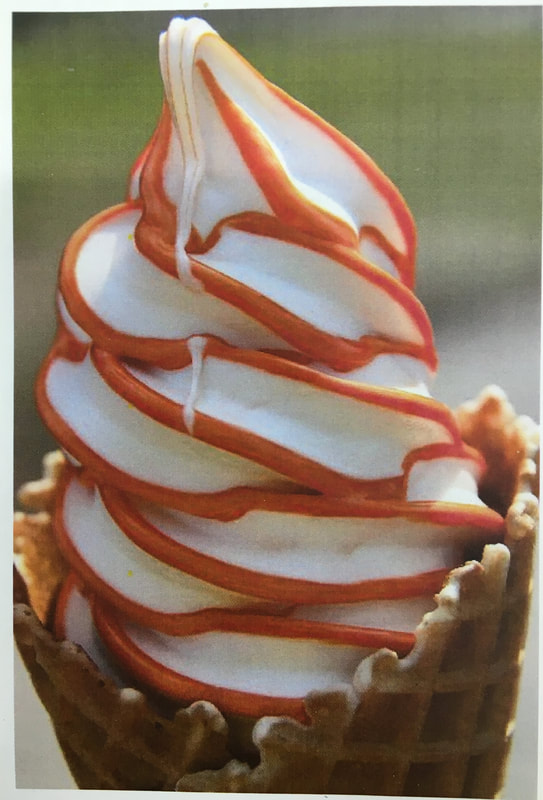
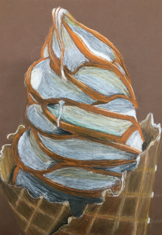
For this piece I copied a picture of ice cream in colored pencil. I practiced adding value, blending, and getting accurate colors in colored pencil.
0 Comments
 Final Piece Critique Questions
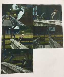
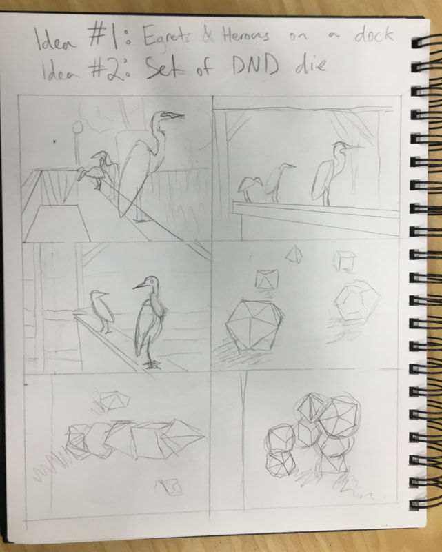
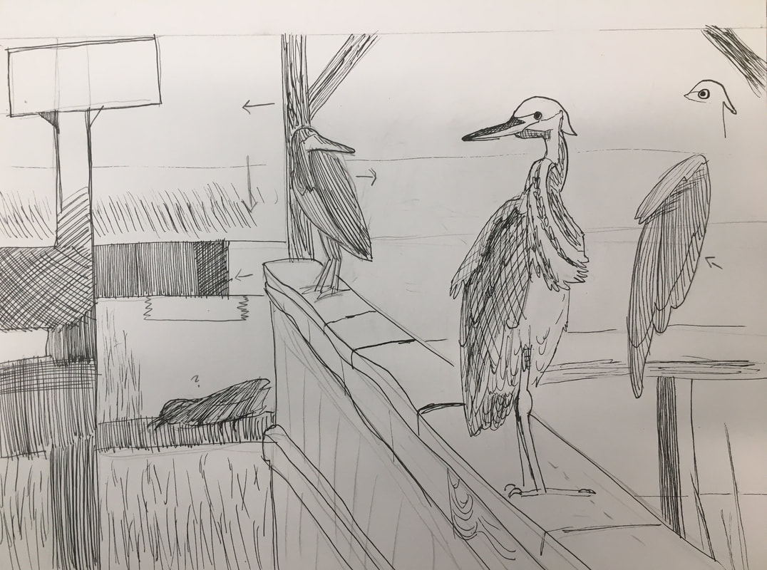
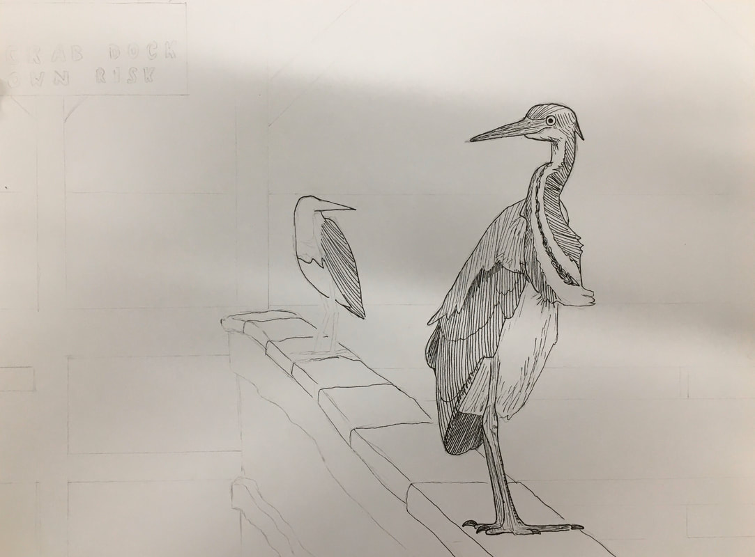
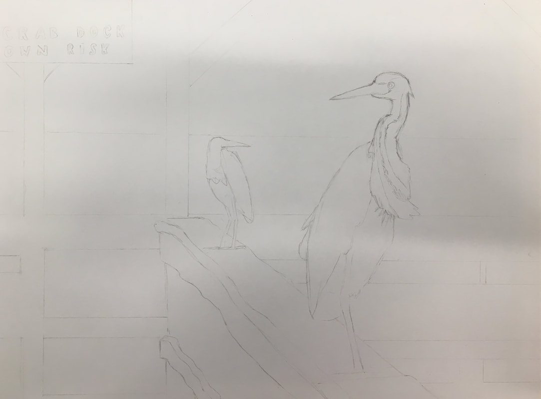
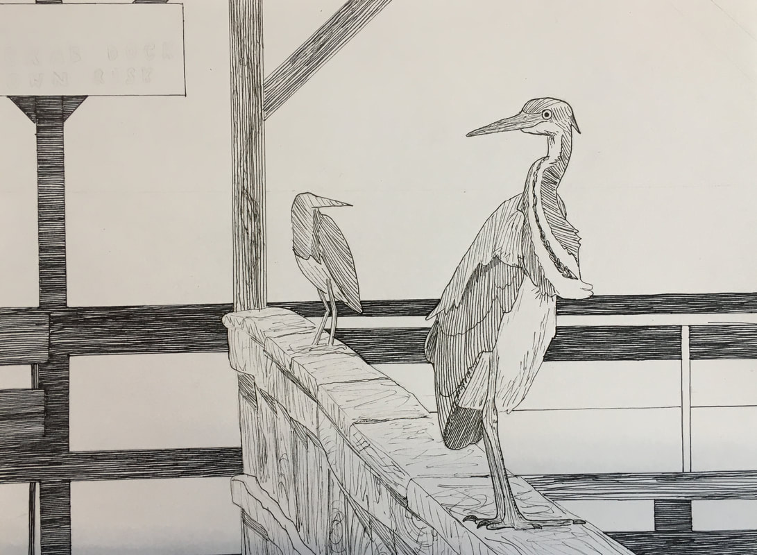
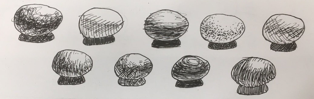
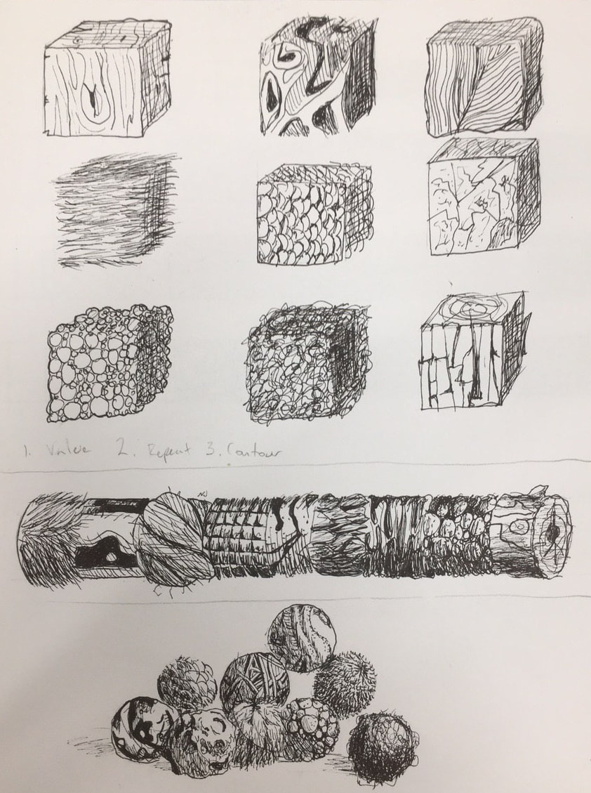
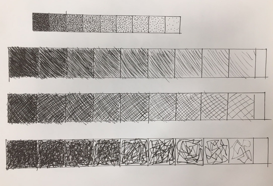
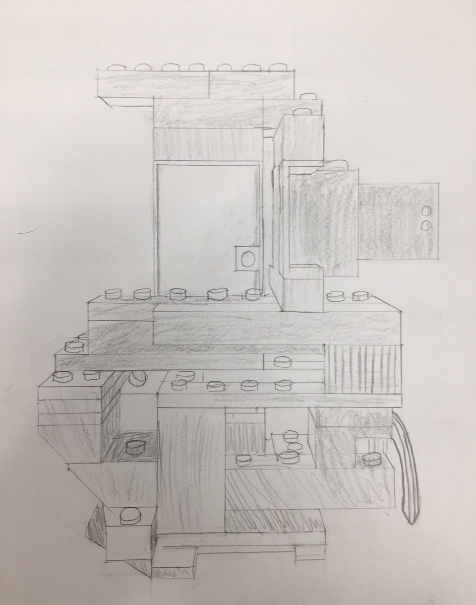
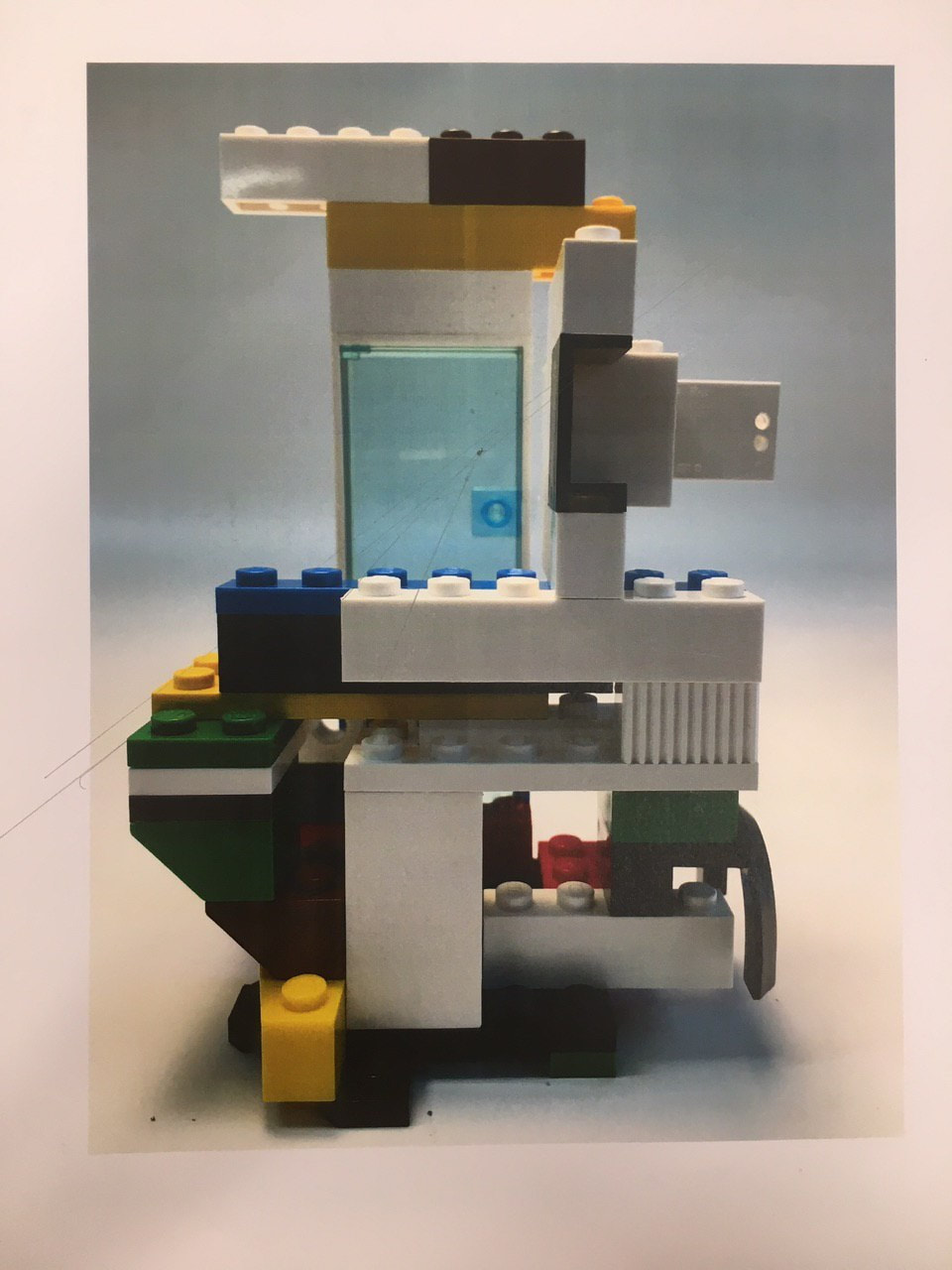
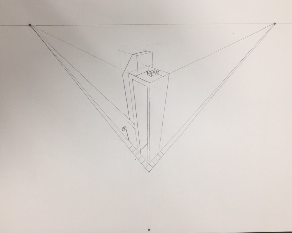
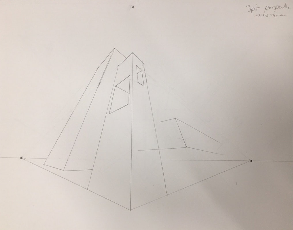
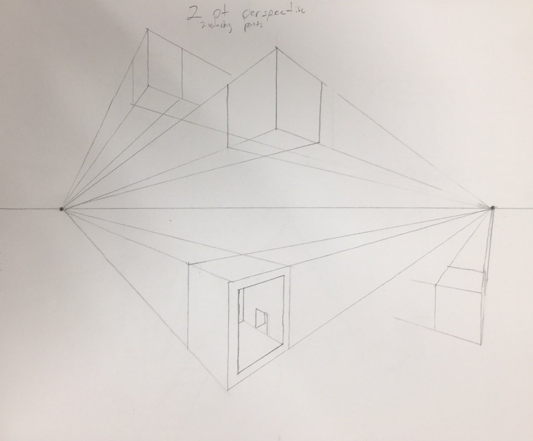
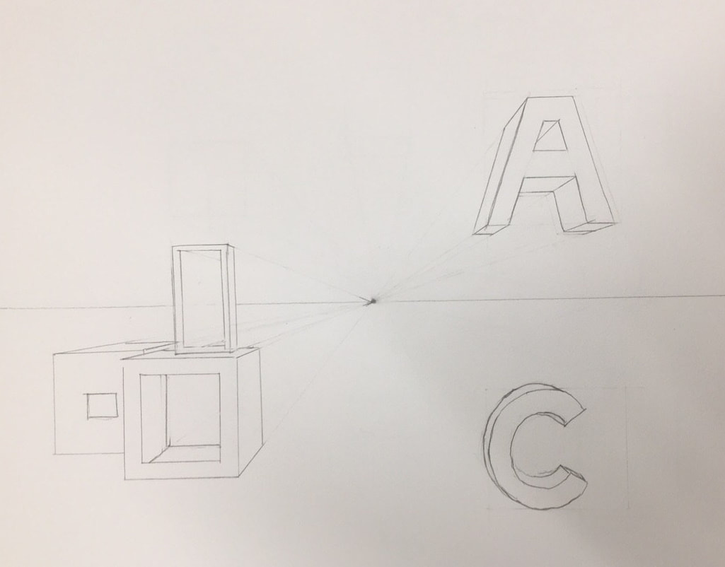
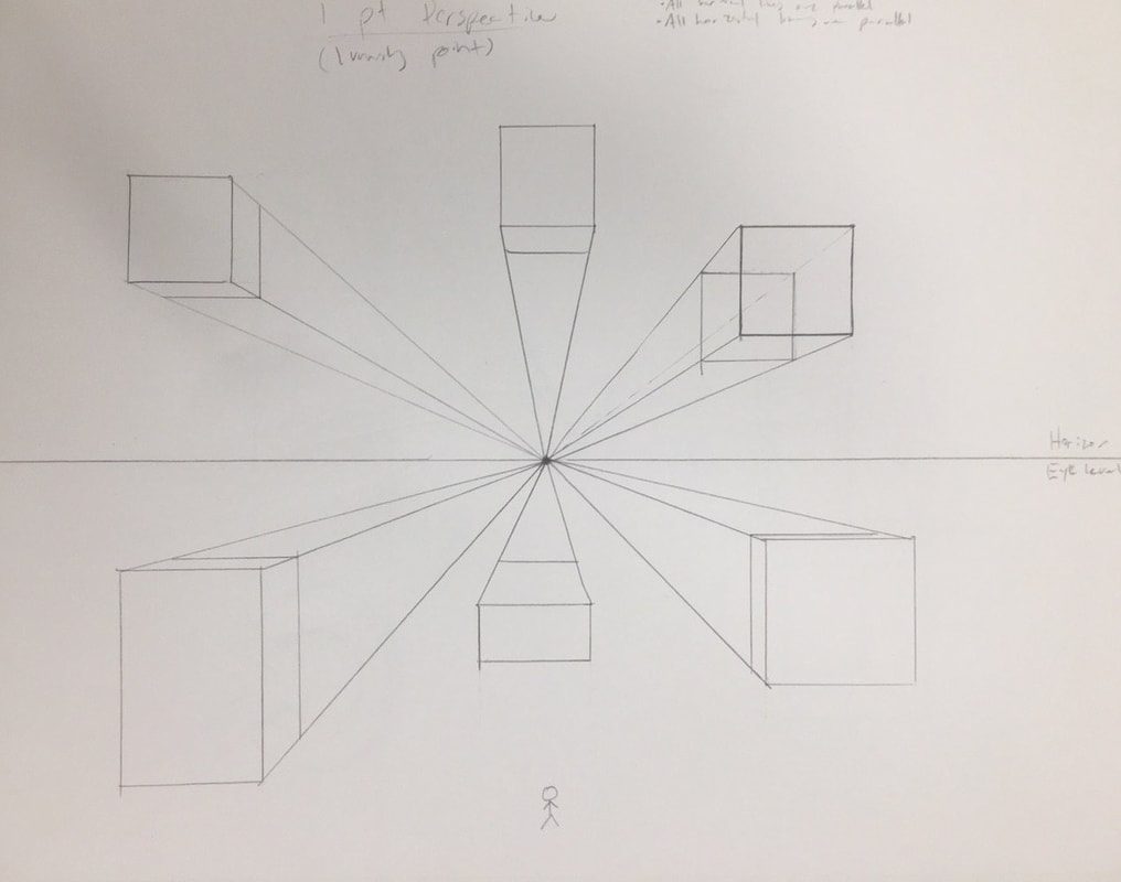
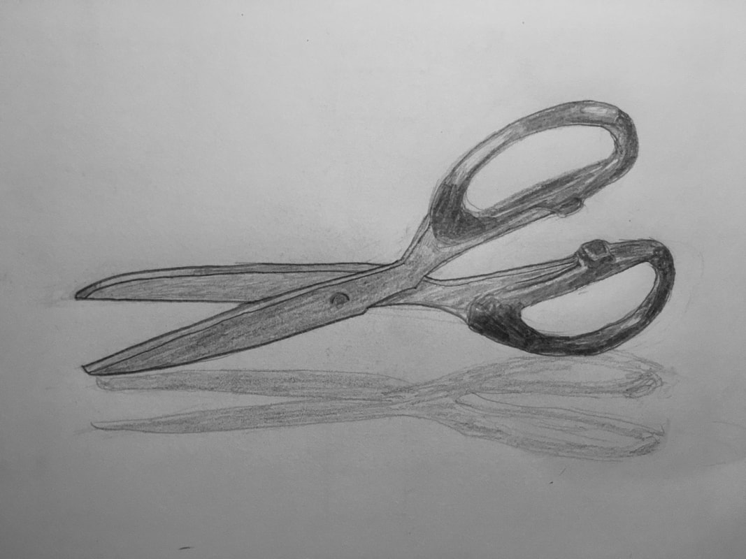
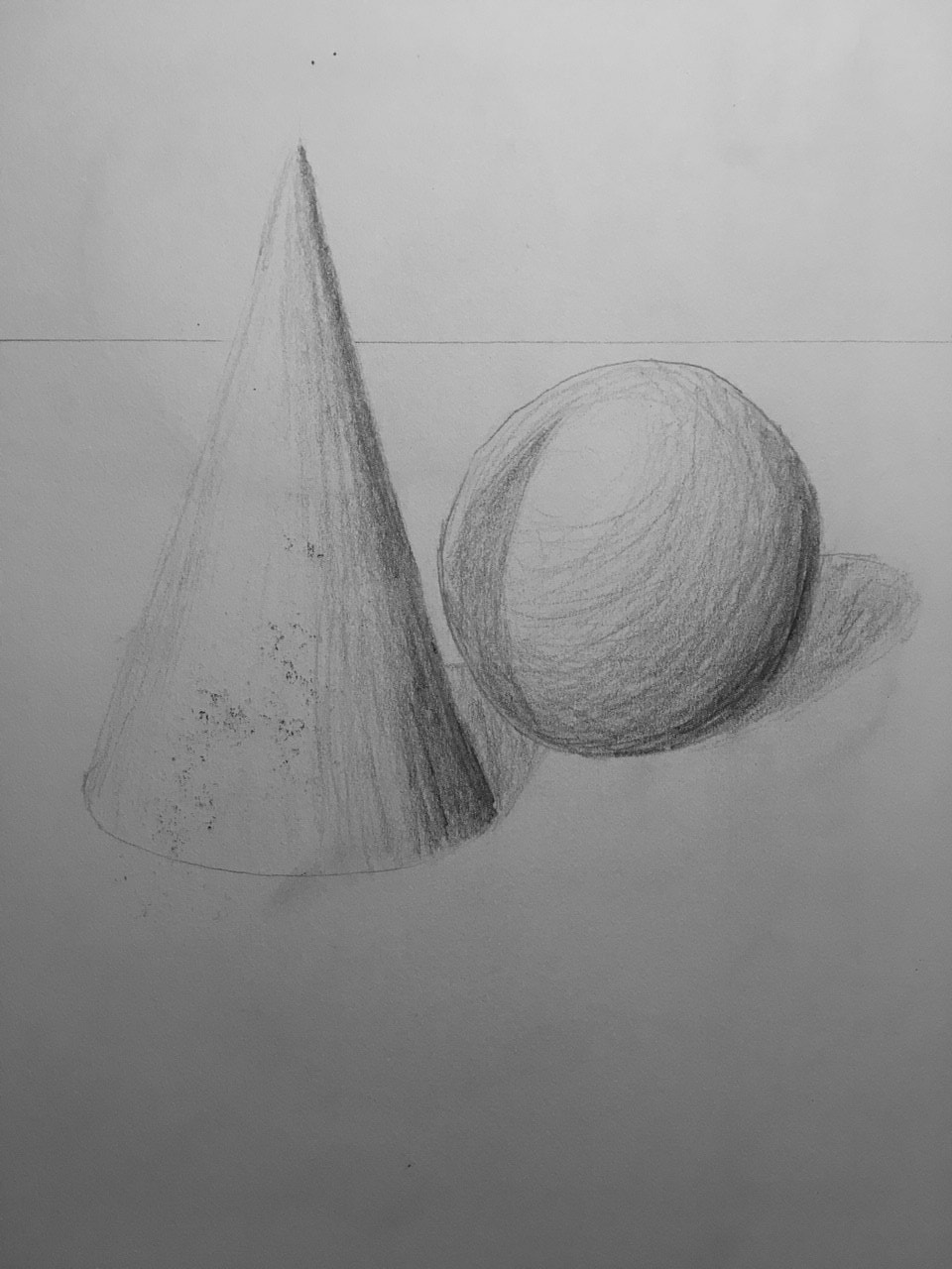
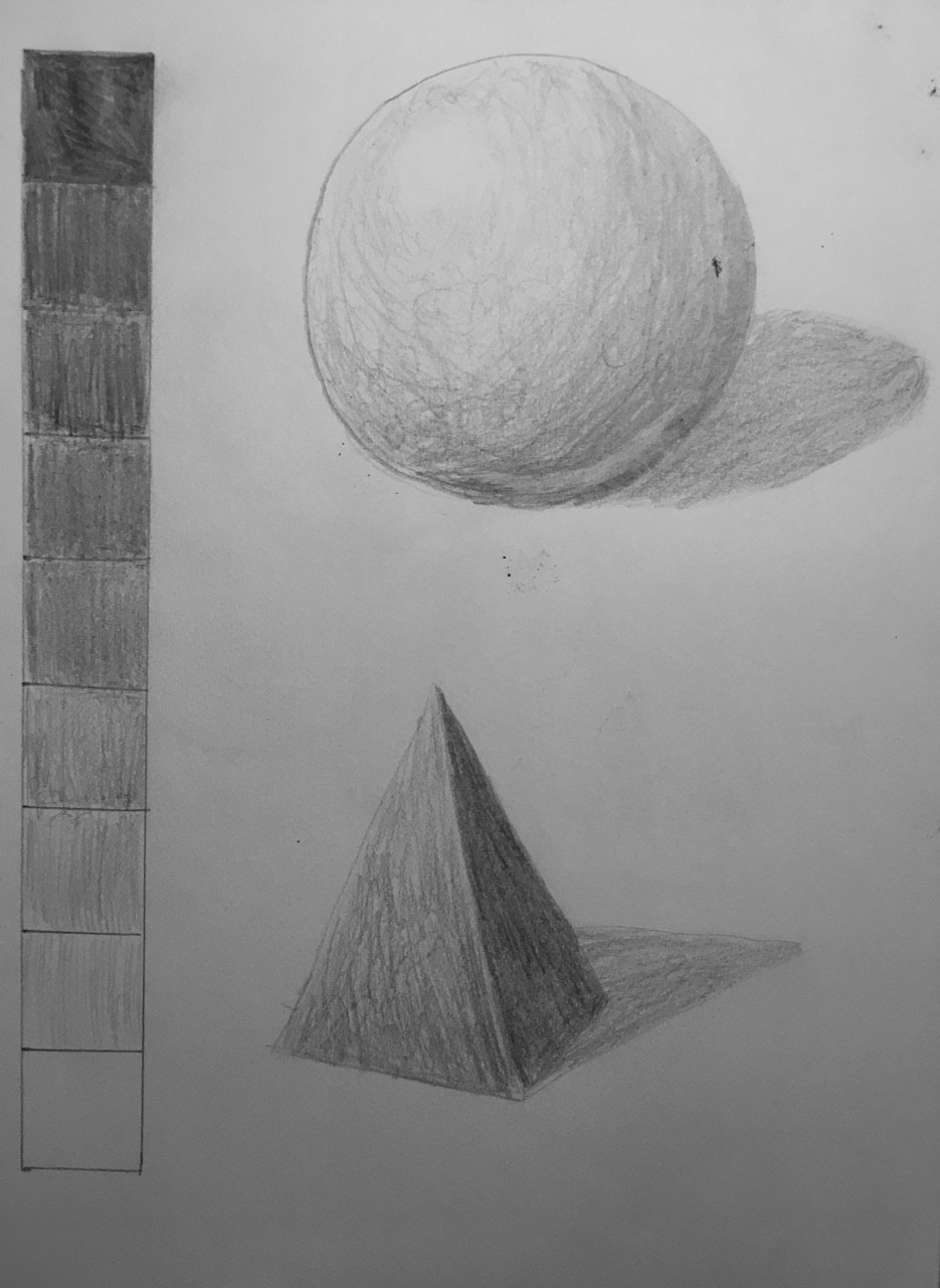
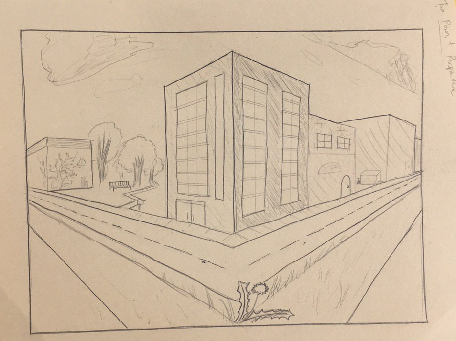
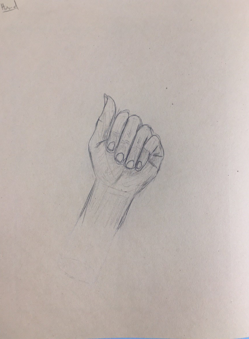
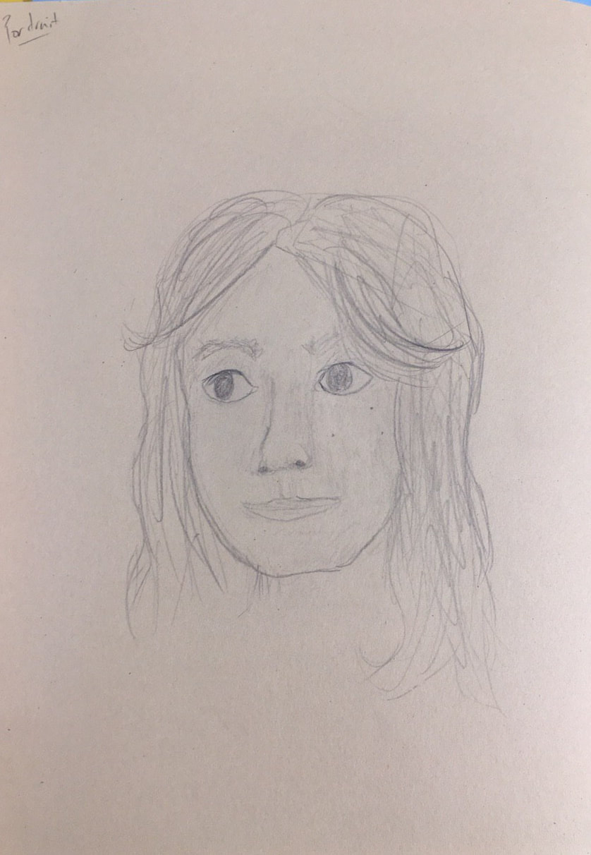
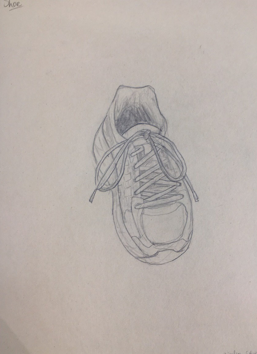
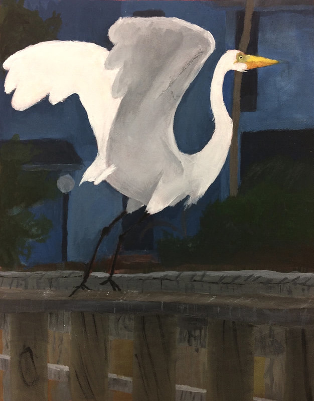
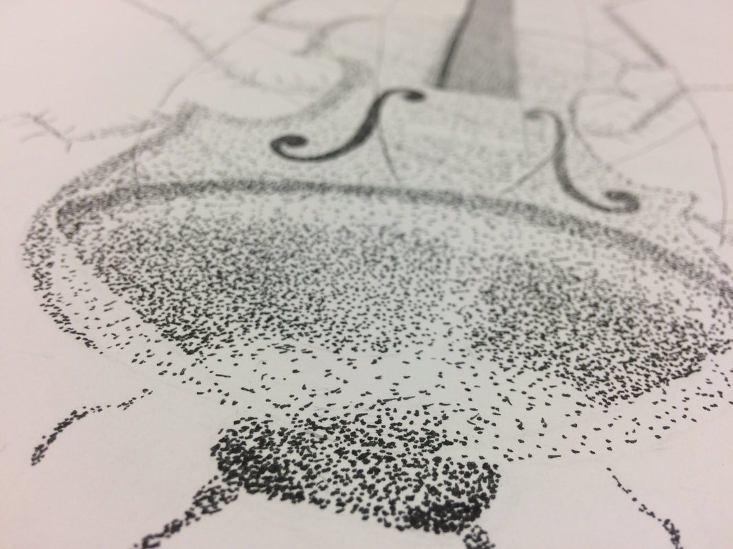
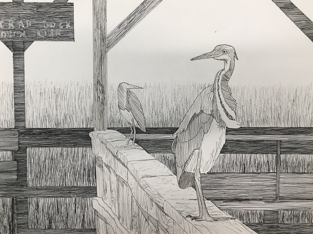
1. Discuss your decision on pen and ink techniques. Why you chose to use one or more. (if you used stippling in certain areas explain WHY you chose this technique. Explain for all other techniques used). I choose to use hatching to add value to my artwork, because I wanted the shading to look very even. Having the background posts be hatched in the same direction really helped remove any sense of texture on them so they would be less eye-catching. For the areas I did want to texture, I used lighter hatching over a texture I created, or no hatching at all. 2. How did you use perspective? Why is perspective important? Perspective was essential to this piece, as it features two herons on a post going toward the viewer. So, I had to make sure the birds were sized right in proportion to how far away they were. Additionally, the rail the birds are standing on goes to a vanishing point, further giving the scene depth with perspective. The size difference creates more emphasis on the front bird as well. 3. How is texture important in your composition? Texture helped me distinguish between different layers such as the wood and grass. The direction/level of detail I used to convey how close an object was. I also wanted to use texture to convey the varying types of feathers/texture of legs in the bird. 4. Why is value so important in this project? I also used value to create contrast and I made sure to give background objects more value. I also used it to give depth to the bird & add realism. 5. Describe your craftsmanship (How well the project is crafted technically) I think I put the most effort and used my sketching skills in creating realistic proportions for the birds. I knew that would be an essential part of making it nice looking. Besides that, I also took careful consideration of composition, using the rule of thirds, placing the bird 1/3 away from the edge of the page. 6. If you could recreate your piece what would you do differently to enhance your final outcome? I might make the grass lighter, to bring out the edges of the wood. I also might have put a bit more detail in the background, maybe including a small bird sitting on a post. 8. When applying the pen and ink techniques why and how is it important to make sure you understand the concepts taught in class? Adding value to create depth is very important to create realism, as well as practicing texture. The various techniques we learned with pen can be used in different contexts for varying effects. 9. As a growing artist how do you think what you have learned will guide and better your future projects. I learned that putting a lot of thought into the initial composition, final sketch, and pencil outline really make the piece the best it can be. Practicing the techniques I planned to use on the final sketch very much helped me make artistic decisions. To start, we made a value chart using stippling, hatching, cross-hatching, and an invented shading method. This was to practice making value using pen. Then, we watched a series of four videos and copied the shapes and textures made in the video.To start, I constructed a Lego creation to photograph and practice perspective with. After printing out the photo, I used a ruler to find the vanishing point in the photo. Finally, I drew out all the lines with a ruler, following one-point perspective rules, and added value at the end.For this assignment, I drew two examples of one-point, one of two-point, and both a worm's eye and bird's eye drawing for three-point. To practice, we started with cubes, but then applied this technique to bubble letters, buildings, street lights, and sidewalks.For this assignment, we drew various objects to practice value. I made a 9-value scale, making sure any two shades can be distinguished. We practiced drawing shapes, first separate, then together, in which a cone casts a shadow on a sphere. Finally, I drew a pair of scissors from a photo. It appears to be impossibly leaning forward due to my omission of the glass it was actually leaning against in the reference photo. It was hard to draw close but distinct values in the scissors. Drawing a solid value more evenly would likely help with this.For this assignment, our prompts were to draw a shoe, a portrait of someone without a reference, a two-point perspective city, and a hand. Overall I enjoyed making these and am most happy with the shoe. I tried to be as realistic as possible when drawing that and the hand, while for the city scape, I went for a cartoony style. For the self-portrait, I tried to make it look okay, but I much prefer to use a reference photo when drawing people.
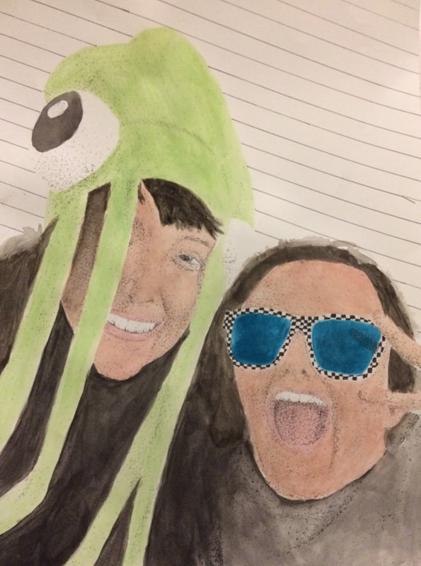
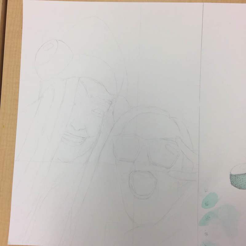
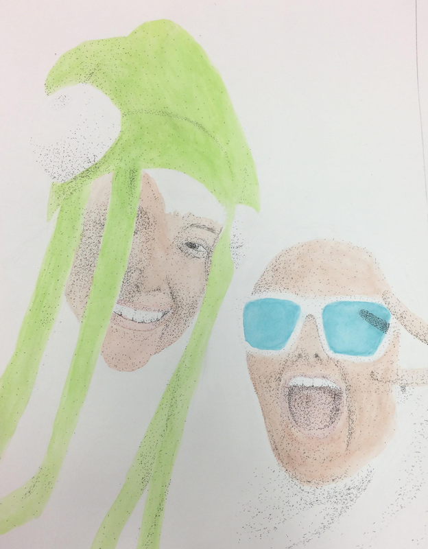
1. I drew a portrait of me and my cousin. We're the same age, so we enjoy seeing each other.
|